Close Menu
KamidoguKamidogu
    YouTube X (Twitter) Instagram Threads Discord
    • GUIDES
      • Modern Era
        • Mortal Kombat 1 (2023)
        • Mortal Kombat 11 (2019)
        • Mortal Kombat X (2015)
        • Mortal Kombat (2011)
      • 3D Era
        • Mortal Kombat vs. DC Universe (2008)
        • Mortal Kombat: Armageddon (2006)
        • Mortal Kombat: Shaolin Monks (2005)
        • Mortal Kombat: Deception (2004)
        • Mortal Kombat: Deadly Alliance (2002)
      • Retro Era
        • Mortal Kombat Gold (1999)
        • Mortal Kombat 4 (1998)
        • Mortal Kombat Trilogy (1996)
        • Ultimate Mortal Kombat 3 (1995)
        • Mortal Kombat 3 (1995)
        • Mortal Kombat II (1993)
        • Mortal Kombat (1992)
    • FORUMS
    • INTERVIEWS
    • PODCAST
    • MEDIA
      • Wallpaper
      • Soundtracks
    • SITE
      • About
      • Privacy Policy
      • Terms of Use
      • Affiliates & Links
      • Archive
        • 2020s
          • 2024
          • 2023
          • 2022
          • 2021
          • 2020
        • 2010s
          • 2019
          • 2018
          • 2017
          • 2016
          • 2015
          • 2014
          • 2013
          • 2012
          • 2011
          • 2010
        • 2000s
          • 2009
          • 2008
          • 2007
          • 2006
          • 2005
      • Contact
    YouTube X (Twitter) Instagram Threads Discord
    KamidoguKamidogu
       Dragon Attack?
    General Mortal Kombat Klassic Mortal Kombat

    Dragon Attack?

    John Tobias Gives Us a History Lesson
    Dustin JamesDustin James24 September 2022
    Dragon Attack
    Share
    Facebook Twitter Copy Link

    John Tobias just dropped a Twitter thread on the history of the Mortal Kombat fragon symbol. Also included was a little naming history as well.

    Taking to Twitter, John Tobias, original art director, designer, and co-creator of Mortal Kombat, detailed the creation of the iconic dragon logo the series has used since its first iteration.

    Here’s a recently discovered image of the very first drawing of #MortalKombat’s dragon icon. I designed the icon as both a symbol of our game and its fictional tournament… (thread) #MK30 pic.twitter.com/vVIDr4K9aP

    — John Tobias (@therealsaibot) September 22, 2022

    The image comes from fellow MK artist John Vogel’s video taped footage used to digitize my pencil drawing. We traced over the digitized image with pixels for use in the game… (2/9) pic.twitter.com/iiYkHIAw6B

    — John Tobias (@therealsaibot) September 22, 2022

    In the second of nine posts in the Twitter thread we see how the original sketch was digitized for use in the game.

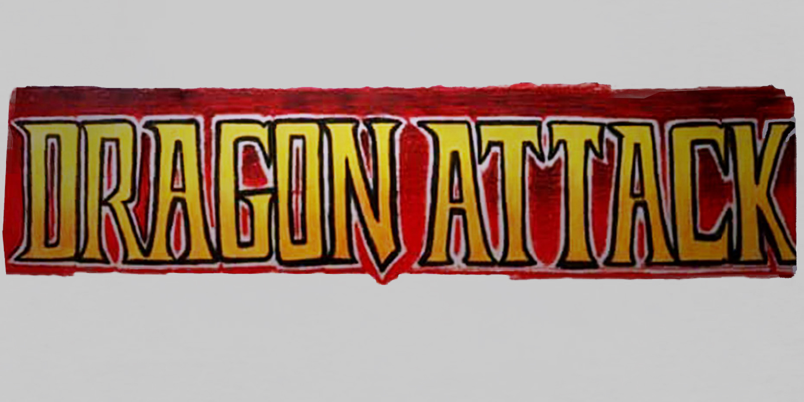
    The inspiration to use a dragon as the fictional tournament’s symbol came from “Dragon Attack,” which was in contention as our game’s title before @noobde and I changed it to “Mortal Kombat.” Here’s my rough marker sketch of the marquee logo… (3/9) pic.twitter.com/g3UY2X2boX

    — John Tobias (@therealsaibot) September 22, 2022

    In the early days of Mortal Kombat, music seemed to play a pretty big part in its creation. In his third tweet we learn that the game was almost called “Dragon Attack” because of Ed Boon‘s affinity for Queen. Thankfully the name was later changed. Mortal Kombat just seems to roll off the tongue a bit easier.

    The name “Dragon Attack” came from @noobde’s love for the band Queen and their song of the same title. I used the colors described in the lyrics of that song on our eventual coin-op cabinet design… (4/9)https://t.co/0lLce4FpJh

    — John Tobias (@therealsaibot) September 22, 2022

    The inspiration for the dragon icon’s design started when John Vogel saw a golden dragon statue on the desk of Midway’s general manager, Ken Fedesna. John borrowed it to digitize for use in our game’s backgrounds. Here’s a frame from that footage… (5/9) pic.twitter.com/QTOQ3q6YLx

    — John Tobias (@therealsaibot) September 22, 2022

    Next Tobias shows us the original dragon that sat on the desk of Midway’s general manager Ken Fedesna, which was the inspiration for the logo. The original dragon statue was even digitized as well for use in the game.

    I saw the dragon statue and thought of using an Asian inspired dragon design as part of our coin-op cabinet’s side panel art. Here are my sketches… (6/9) pic.twitter.com/Lx9MCPCW1m

    — John Tobias (@therealsaibot) September 22, 2022

    I had been thinking of creating an icon to represent the fictional tournament, but also to brand the game with a symbol… like Superman’s “S” or Batman’s bat symbol. I used the dragon from my cabinet side panel sketch to inform the look of the dragon icon as our symbol… (7/9) pic.twitter.com/EV2NNQaXDg

    — John Tobias (@therealsaibot) September 22, 2022

    Following that, we see just how intricately woven the dragon is in the fabric of the first game. The same dragon that inspired the logo, also inspired the cabinet art. John was attempting to create something as iconic as the Superman “S” logo, or the Bat-symbol, with the dragon. Eventually, John and the team were made to choose which version of the logo was the “official” version for copyright purposes. They chose the right facing version.

    Up until MKII we used the icon facing both left and right. With Acclaim’s console releases, we had to pick one or the other for trademarking purposes. We chose facing right and it’s been that way ever since… (8/9) pic.twitter.com/XPMTEnuV2M

    — John Tobias (@therealsaibot) September 22, 2022

    Keeping in line with the version of the lore that Tobias has originally created, the dragon logo was a sort of play on the ancient yin-yang symbol, intended to represent the balance of the furies which played a major role in the lore at the time.

    Here’s my earliest icon doodle recently found by @youngsaibot while poking around an old sketchbook in my office. The eventual icon design was an attempt at replicating the yin yang symbol, which represented balancing of the furies- a core part of MK’s early fiction. (9/9) pic.twitter.com/youtSOn45T

    — John Tobias (@therealsaibot) September 22, 2022

    Dragon Attack or Mortal Kombat? Which do you prefer?

    Avatar photo
    Dustin James
    • Facebook
    • X (Twitter)
    • Instagram

    Dustin has been a fan of Mortal Kombat since the very first “Toasty” Fatality he saw on an MK1 machine in ’92. That moment made him an instant lore-hound as well, devouring each new game and its story. Today he runs a YouTube channel, Generally Nerdy, is a tech director for Black Lion Endeavors Corporation, and is all around nerdy kind of guy with a love of metal music, fighting and FPS games, photography and food.

    Related Posts

    Ashrah Character Analysis and Why Her Mortal Kombat 1 Version Needed to Do Much Better

    5 January 2024

    Mortal Kombat Legends: Cage Match Cover and Release Date Revealed

    22 July 2023
    Add A Comment
    Leave A Reply Cancel Reply

    You must be logged in to post a comment.

    Podcast
    Podcast
    Kamidogu
    YouTube X (Twitter) Instagram Threads Discord
    Copyright © 2005-2025 Kamidogu. No part of this site may be reproduced in whole or in part without permission. NetherRealm Studios, the NetherRealm Studios logo, Mortal Kombat®, Injustice® and all related characters and elements are ™ and © Warner Bros. Entertainment Inc. The WB Games logo and WB Shield are ™ and © Warner Bros. Entertainment Inc. The DC logo, all characters, their distinctive likenesses and related elements are trademarks of DC Comics © 2025.

    Type above and press Enter to search. Press Esc to cancel.